A night-sky hero lit by real aurora curtains of mint, lime and cyan rays, with the headline held in a frosted-glass card with a specular rim, fine grain and floating glass tiles. Includes a pale-fog light theme with the same hues.
A live preview. All names and text in it are placeholders.
Want this on your own site? Pick it for your plan.
Copy the prompt
Pick your AI tool, copy, and paste it in. Replace anything in [SQUARE BRACKETS] with your own content.
Which AI tool are you pasting this into?
ROLE AND GOAL
Build a cinematic hero section for a software product site. The star is a real aurora: two warped curtains of vertical light rays plus soft mesh glow drift behind a single frosted-glass card that holds a mono badge, the headline, subcopy, a primary and a ghost button and a reassurance line. A floating glass nav pill sits above, and two small decorative glass tiles (a sparkline and a progress ring) overlap the card corners. Colour story: ink-teal night with mint, lime and cyan light and one low coral glow (never purple). Include a pale fog light theme with the same hues.

STACK
React (TypeScript, single component, no extra libraries). The aurora needs real CSS (SVG masks and filter, mask-composite rim, grain, keyframes), so styling lives in one scoped style tag with prefixed class names; Tailwind utilities are optional for layout if the project already has it. Plain HTML/CSS version on request. Works in Claude, Cursor, v0, Lovable and Bolt.

DESIGN TOKENS
Colors, dark theme (default when the system is dark):
- Page background: #031214 fading to #020B0D at the edges; text #F2FBF9; muted #B7D3CF
- Aurora lights: mint #14DDB8, lime #C6F432, coral #FF6B57, cyan #33C6F5, composited with mix-blend-mode screen
- Glass card: background rgba(3, 20, 23, 0.62), solid fallback #082B2F, sheen rgba(255, 255, 255, 0.12), inner glow rgba(20, 221, 184, 0.16), specular rim running rgba(255, 255, 255, 0.70) at the top left to rgba(255, 255, 255, 0.12) at 30 percent, then clear, then rgba(255, 255, 255, 0.30) at the bottom right
- Badge: pill background rgba(255, 255, 255, 0.07), border rgba(255, 255, 255, 0.18); inner tag fill #C6F432 with text #04171A
- Primary button: vertical gradient #E2FF74 to #BBEA25, text #06201E, glow rgba(198, 244, 50, 0.50)
- Ghost button: fill rgba(255, 255, 255, 0.06), border rgba(255, 255, 255, 0.28), hover fill rgba(255, 255, 255, 0.14)
- Headline highlight gradient (last three words): #DFFF7A to #7DF7CB to #5BD8F7 at 100 degrees
- Focus ring: #C6F432
Colors, light theme (pale fog):
- Page background: #E6F2EF fading to #D5EAE6; text #062A2C; muted #35585B
- Aurora lights: mint #19C9AE, lime #A9E43A, coral #FF8D6B, cyan #3DC9F0, ribbons use mix-blend-mode multiply at 85 percent opacity, mesh glow uses normal blending
- Glass card: background rgba(255, 255, 255, 0.50), solid fallback #F6FBFA, sheen rgba(255, 255, 255, 0.70), inner glow rgba(25, 201, 174, 0.20), rim rgba(255, 255, 255, 0.95) to rgba(255, 255, 255, 0.35) to clear to rgba(6, 42, 44, 0.16)
- Badge: background rgba(255, 255, 255, 0.55), border rgba(6, 42, 44, 0.14); inner tag fill #062A2C with text #E8FFF6
- Primary button: gradient #14565B to #062F33, text #F2FFF9, glow rgba(6, 47, 51, 0.40)
- Ghost button: fill rgba(255, 255, 255, 0.55), border rgba(6, 42, 44, 0.22), hover fill rgba(255, 255, 255, 0.85)
- Headline highlight gradient: #0A7A5E to #0E8C8F to #1677B0; focus ring #0A7A5E
Fonts: Manrope (weights 700 and 800) as the primary token, fallback stack ui-sans-serif, system-ui, -apple-system, "Segoe UI", Roboto, "Helvetica Neue", Arial, sans-serif. Badge, tile labels and section eyebrows use the system monospace stack ui-monospace, "SF Mono", SFMono-Regular, Menlo, Consolas, monospace.
Type scale:
- Headline h1: clamp(2.375rem, 6.4vw, 5rem), weight 800, line-height 1.02, letter-spacing -0.045em, balanced wrapping
- Subcopy: clamp(1rem, 1.5vw, 1.1875rem), line-height 1.6, max-width 46ch, muted
- Badge: 0.75rem monospace, weight 600; inner tag uppercase with 0.08em tracking
- Buttons: 0.9375rem, weight 800; nav links 0.9375rem; logo 1.0625rem weight 800
- Note line under the buttons: 0.8125rem, muted
Spacing: hero padding clamp(14px, 2.4vw, 28px) at the top, 16px at the sides (32px from 640px, 48px from 1024px), clamp(36px, 6vw, 80px) at the bottom. Card padding clamp(30px, 5.4vw, 68px) top, clamp(20px, 5.4vw, 72px) sides, clamp(28px, 4.6vw, 54px) bottom. Badge to headline clamp(20px, 3vw, 30px); headline to subcopy clamp(18px, 2.6vw, 26px); subcopy to buttons clamp(26px, 4vw, 38px).
Radius: card 32px; tiles 20px; nav pill, buttons and badge fully round (999px).
Shadows: card 0 60px 100px -40px rgba(0, 0, 0, 0.85) plus 0 14px 40px -14px rgba(0, 0, 0, 0.60) in dark; 0 50px 90px -40px rgba(6, 60, 62, 0.45) plus 0 12px 30px -12px rgba(6, 60, 62, 0.18) in light; always plus an inner glow and an inner 1px top highlight.
Blur and grain: card backdrop blur(28px) saturate(170%); nav pill and tiles blur(16px) to blur(18px); full-page film grain from an inline SVG feTurbulence data URI (baseFrequency 0.85, 2 octaves) at 16 percent opacity in dark and 20 percent in light, overlay blend; a second finer grain at 30 percent inside the card, soft-light blend.

LAYOUT
- A full-height section (min-height 100svh), overflow hidden, with a sky layer behind everything (z-index below content, pointer-events none, aria-hidden). Back to front: soft mesh glow, stars (dark theme only), aurora curtain A, aurora curtain B, an edge vignette, the grain.
- Mesh glow: three radial-gradient ellipses. Mint at the top left (about 78vw wide, 46 percent mix), lime at the top right (about 60vw, 32 percent mix), coral as a low horizon glow at the bottom right (about 64vw wide and 16vw tall, 60 percent mix). Size them in vw with a pixel minimum, never in vmax.
- Stars: fifteen 1px to 1.4px white radial-gradient dots scattered over the upper two thirds and the edges, 90 percent opacity, twinkling between 55 and 95 percent.
- Aurora curtains: each is its own absolutely positioned inline SVG (left -6 percent, top -4 percent, 112 percent wide, 108 percent tall, viewBox 0 0 1440 960, preserveAspectRatio xMidYMid slice). Curtain A holds two wide rectangles filled with a horizontal gradient cyan, mint, lime, mint, cyan (offsets 0, 0.3, 0.56, 0.8, 1). One is masked by a vertical fade (transparent at y 30, 40 percent at 55 percent of the way, full at 90 percent, ending near y 360) for a soft wash at 80 percent opacity; the other is masked by a repeating ray pattern, 61 units wide, with six vertical strips of different widths (1.2 to 11 units) and opacities (0.45 to 1), each strip filled with the same vertical fade, for a curtain of light rays at 90 percent opacity. Curtain B is the same recipe lower in the frame (fade from y 540 to y 840), gradient cyan, mint, lime, ray pattern 73 units wide, at 70 to 85 percent opacity.
- Both curtains pass through one SVG filter: feTurbulence fractalNoise (baseFrequency 0.0016 0.0024 for A with seed 11, 0.0019 0.003 for B with seed 4, 2 octaves), an feColorMatrix that keeps only the green channel as the Y offset and fixes red at 0.5 so rays are never sheared sideways, an feDisplacementMap with scale 330 (A) or 280 (B), then two blurs merged: stdDeviation 26 for the glow plus stdDeviation 2 for crisp ray detail. Filter region x -10 percent, y -30 percent, width 120 percent, height 160 percent.
- Nav: a floating glass pill (max-width 1040px, centered, 1px border, backdrop blur 16px): wave logo mark plus name on the left; Product, Customers, Docs and a small bordered Sign in button on the right. Under 640px only the Sign in button shows.
- The card sits in the center of the remaining space inside a 820px frame: width 100 percent, text centered. Inside, in order: the badge (a pill holding a small uppercase tag with a pinging dot, the release name and a small arrow), h1 (last three words in a span with the highlight gradient, clipped to text, with a plain color fallback), subcopy, button row, then a note line with a small check icon.
- Card surface: a 1px specular rim drawn with a pseudo-element using a 145 degree gradient and mask-composite exclude; a sheen pseudo-element with a radial highlight at the top left plus the fine grain.
- Tiles (hidden below 1024px, aria-hidden): a 212px sparkline tile overlapping the bottom left corner (left -88px, bottom -34px) with a mono label, a Live marker and a mint-to-lime area chart; and a 118px progress-ring tile overlapping the top right corner (right -74px, top -38px) with a lime-to-mint arc and a check mark.
- Under 480px the two buttons stack full-width; from 480px they sit side by side, centered with a 12px gap.
Breakpoints: 360 (card nearly full width, stacked buttons, headline about 38px, no tiles), 768 (nav links appear), 1024 and 1440 (tiles appear, headline reaches 80px, frame stays 820px wide).

MOTION
- Curtain drift, transform on each SVG element only, ease-in-out, infinite, alternate: curtain A 24s from translate -34px, 4px and scale 1.02 to translate 38px, -10px and scale 1.07; curtain B 31s from translate 40px, 0 and scale 1.06 to translate -36px, 8px and scale 1.01. Use will-change: transform so the filter is rasterized once and the compositor moves the layer.
- Mesh glow drift: 36s, 43s and 49s alternate translations of about 6 to 8vw. Stars twinkle 7s alternate.
- Card entrance: opacity 0, translateY 14px and scale 0.99 to rest over 560ms with cubic-bezier(0.2, 0.7, 0.2, 1), so the section is complete shortly after load.
- Badge dot pings (scale 0.5 to 1.5 while fading out, 2.4s). Tiles bob 5px to 7px (9s and 11s alternate).
- Buttons: hover lifts 2px over 200ms with the same easing; active returns with scale 0.985.
- prefers-reduced-motion: reduce: all animations stop (everything rests in its start state, fully visible), no button transitions.

CONTENT SLOTS
[PRODUCT NAME] and a short wave-style logo mark
[BADGE TEXT] for example the release name after the New tag
[HEADLINE] one sentence; wrap the last three words for the gradient highlight
[SUBCOPY] one or two plain sentences on who it is for and what changes for them
[PRIMARY BUTTON LABEL] for example "Get started"
[SECONDARY BUTTON LABEL] for example "Watch the demo"
[NOTE LINE] one short reassurance line, such as what the free plan includes
[NAV LINKS] three links plus Sign in
[TILE LABEL] a short metric name for the decorative sparkline tile

ACCESSIBILITY AND PERFORMANCE
- Text must be at least 4.5:1 against what is behind it. The dark glass is tinted (62 percent ink teal) precisely so the headline and subcopy stay readable over the lime and mint light; the light glass is 50 percent white over a pale ground.
- backdrop-filter must have a fallback: wrap it in @supports and keep the solid card color (#082B2F dark, #F6FBFA light) as the default background.
- Visible focus: 2px outline in the focus color, 3px offset, on links and buttons.
- Semantics: nav with an aria-label, main, one h1 inside a section labelled by it; the sky layer and both tiles are aria-hidden.
- Animate only transform and opacity; the SVG filter and the blurs are rasterized once per curtain. Keep to two curtains and three mesh ellipses.
- No images, no libraries, no scripts, no network requests. No horizontal scroll at 360px.

DO
- Keep the glass card tinted dark in the dark theme so the text stays readable.
- Keep the curtain motion slow enough that it is felt, not watched.
- Keep the displacement on the Y axis only so the rays stay vertical and the lower edge undulates like a real curtain.
- Keep the colors in one luminous family: cyan, mint and lime light, with coral only as a low glow.
- Keep the rim and the inner top highlight on the card; they sell the glass.
- Keep the light theme genuinely light: pale fog, soft pastels, dark teal button.
- Respect reduced motion by stopping every animation.

DON'T
- Don't use purple, indigo or a purple-to-blue gradient anywhere, and don't run the headline gradient through brown or red.
- Don't add more than two curtains or a particle system.
- Don't make the glass so transparent that the headline fights the aurora.
- Don't animate the SVG filter, blur, width, height or box-shadow.
- Don't stack glass cards inside glass cards.
- Don't use gradient text for more than the last three words.
- Don't size the mesh glow in vmax, and don't remove the solid fallback for browsers without backdrop-filter.
Added for Claude
Return one complete file, then list what you assumed. Keep every rgba value, the SVG filter numbers, the ray pattern widths and every keyframe duration exactly as written.
Aurora Glass is a hero for products that want atmosphere and depth without the usual purple-to-blue haze. Two curtains of vertical light rays are drawn in inline SVG, bent into slow undulating waves by a displacement filter and tinted cyan, mint and lime, with a soft mesh glow and a low coral horizon behind them. In front sits one frosted-glass card with a tinted blurred backdrop, a 1px specular rim, an inner glow and fine film grain, so the headline stays readable wherever the light falls. A floating glass nav, a monospace release badge, a glowing primary button and two small glass tiles (a sparkline and a progress ring) make it read like a finished studio site. The headline highlight runs lime to mint to sky blue, never through brown. A solid fallback covers browsers without backdrop-filter, and every animation stops for visitors who prefer reduced motion. The pale-fog light theme keeps the same hues. It suits analytics tools, developer platforms, AI products and fintech dashboards. There are no images, no scripts and no libraries.
Pairs well with the Orbit and Nocturne Looks in the Dapols website studio. See website examples.
Questions about this design
How is the aurora made without images?
Two inline SVGs each draw a gradient-filled rectangle, masked into thin vertical rays and passed through a displacement filter that bends only the vertical position. The result is a curtain whose lower edge undulates like real aurora. Nothing is downloaded and no script runs.
What happens in browsers without backdrop-filter?
The card keeps a solid background color, so the text is still fully readable. The frosted blur is added only inside an @supports check, so older browsers simply see a clean opaque card on top of the aurora.
Is the aurora heavy for performance?
Each curtain is its own SVG layer. The filter is rasterized once and only the layer's transform animates, which browsers run on the compositor. For low-power devices, lower the blur radius in the filter or drop the second curtain.
More prompts you may like
HeroWith a plan
Quiet Grain Hero
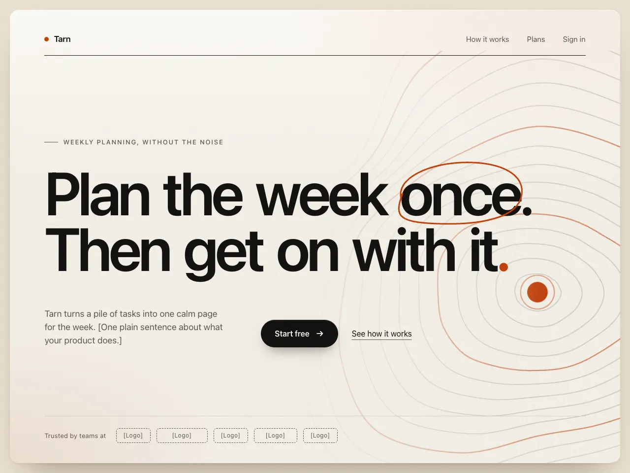
A calm, confident hero on a sheet of grainy paper: one huge tight-tracked headline with a hand-drawn accent loop, a topographic contour map of a mountain lake as the only graphic, one button and one quiet link. Warm off-white, near-black and one restrained accent.
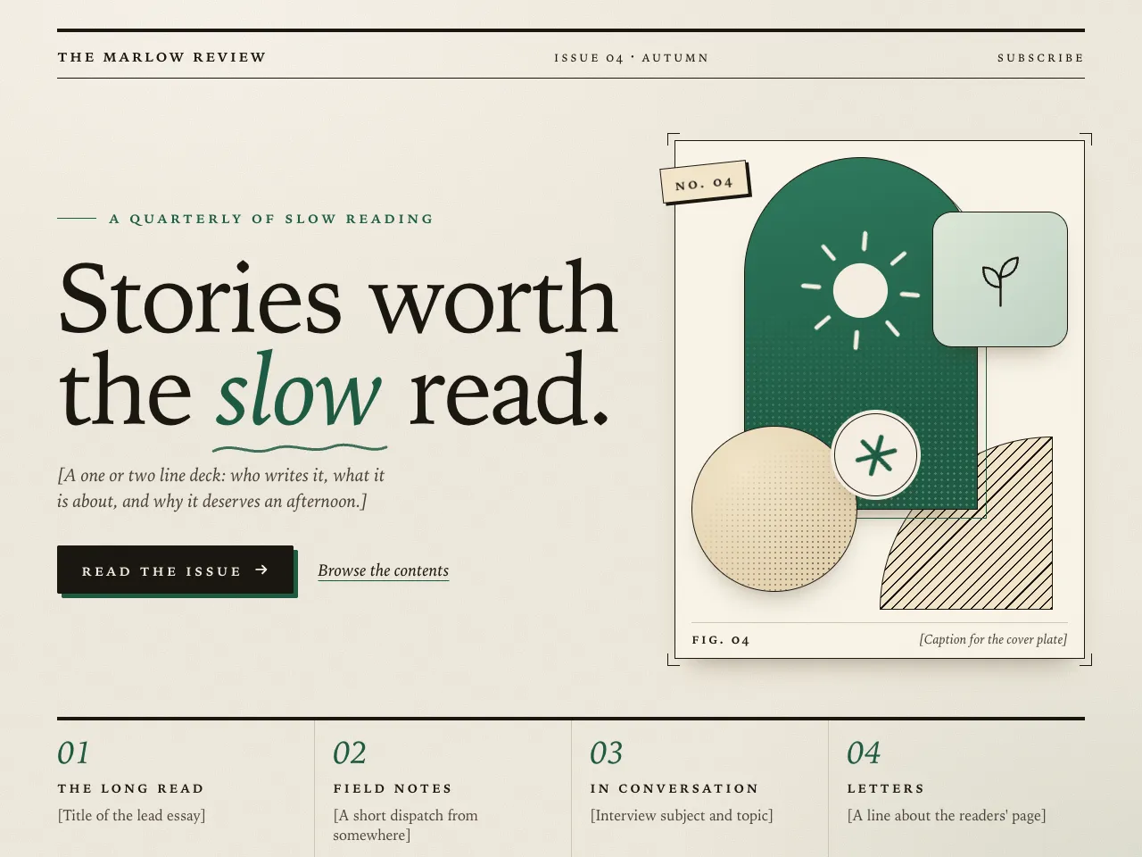
A magazine-style hero on grainy paper: an oversized serif headline with an italic spot-colour word, a flat-shadow button, a framed riso-print plate collage built only from CSS shapes, halftone dots and two tiny pictograms, and a numbered issue strip. Ink on paper with one spot colour.
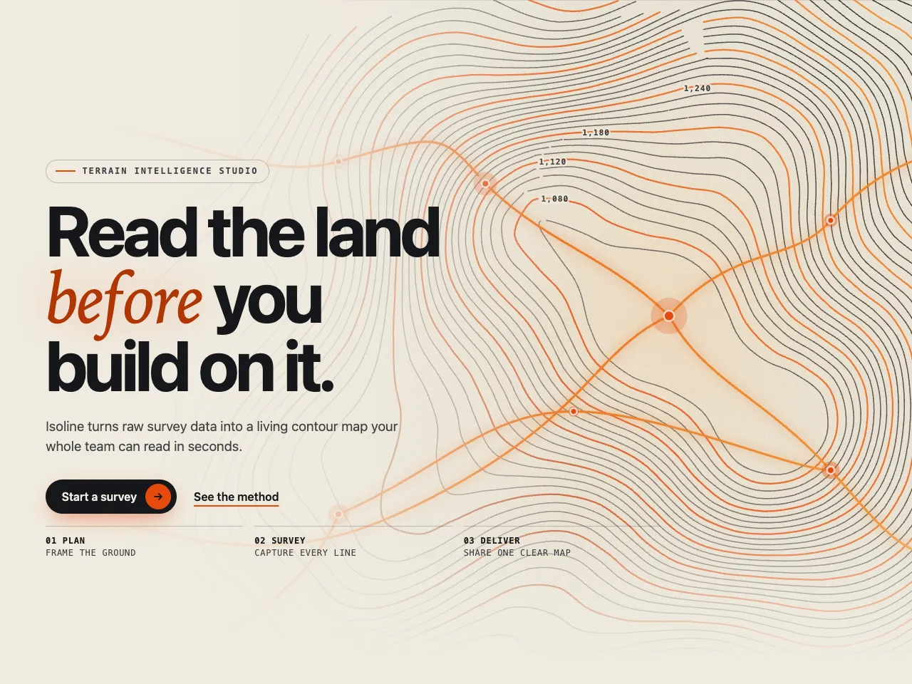
A bold editorial hero built around a luminous self-drawing SVG contour map: dozens of flowing lines trace themselves in over a soft sun glow, glowing routes ignite, nodes pulse, and hovering lights the nearest line.
Need a whole site, not one section? Pick the designs you like, choose your colors and fonts, and Dapols builds the website for you as part of your plan. Answer a few questions about your business to get started.