
Siirry pääsisältöön

Prompts

Pricing section prompts

A pricing section turns interest into a decision, so clarity beats decoration. These prompts lay out plans side by side on a wide screen and stack them in a sensible order on a phone, make the recommended plan obvious without shouting, and keep the details readable. The figures in every preview are sample placeholders, marked as such, so nothing in the design implies a real price. Replace the plan names, amounts and feature lists with your own, and keep billing wording honest: say what is charged, how often and what happens if someone cancels.

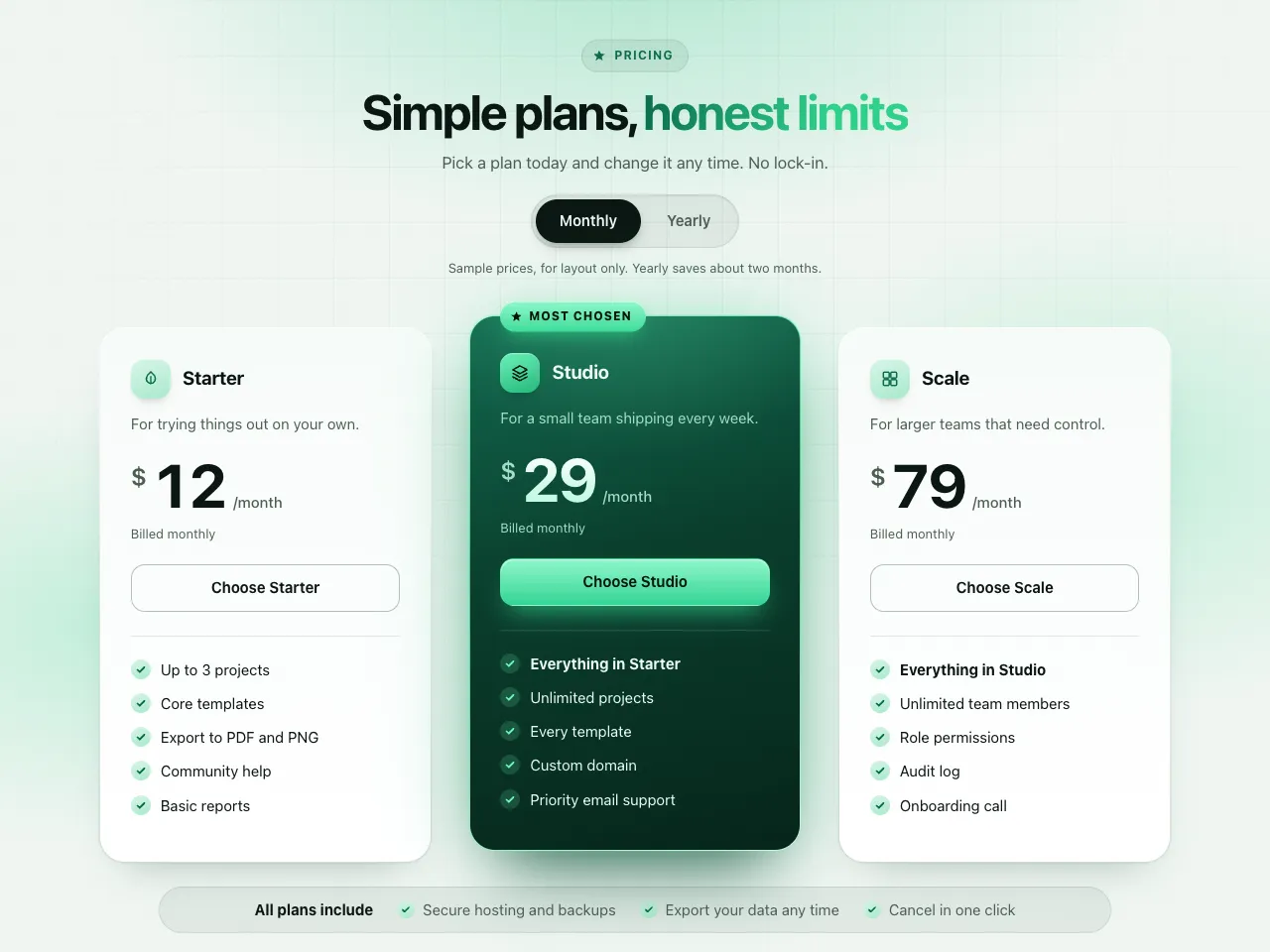
  • Emerald Glow Three-Tier Pricing preview

    PricingWith a plan

    Emerald Glow Three-Tier Pricing

    Three pricing plans with a deep emerald, glowing middle plan, a glossy ribbon, a real monthly and yearly switch, icon chips, check-bubble feature lists and an all-plans strip. Aurora glow, fine grid and grain behind a calm emerald palette.

    • Minimal
    • Cl
    • Cu
    • v0
    • Lo
    • Bo
    • GP
    View

See every prompt

Questions

Should the recommended plan be highlighted?

Usually yes, but quietly: a border, a small label or a slightly raised card is enough. Loud badges and glow make a page feel pushy and are harder to read. The prompts here use restrained emphasis.

Are the prices in the preview real?

No. They are sample figures so the layout makes sense. Replace every plan name, amount and feature with your own before you publish.