Pular para o conteúdo principal

Prompts

Navbar prompts

The navigation bar is on every page, so small flaws repeat everywhere. A good one stays out of the way, keeps the main call to action reachable and works with a keyboard and on a phone. These prompts describe the bar at rest and as someone scrolls, how links collapse into a menu on narrow screens, and what the focus and open states look like. If you were looking for a sticky navbar or header prompt for React and Tailwind, check how each design handles scrolling and the mobile menu before you pick.

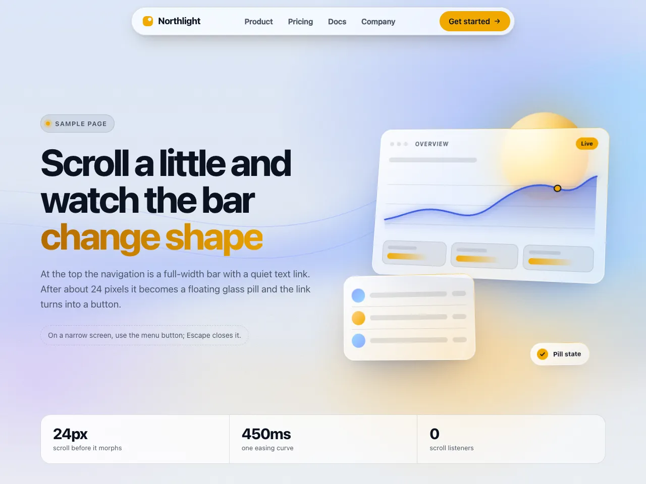
  • Morphing Glass Navbar preview

    NavbarWith a plan

    Morphing Glass Navbar

    A sticky navbar that starts as a full-width bar with a text link and, after a little scroll, shrinks into a floating glass pill with a filled button. Shown over an aurora hero with glass cards and a refraction-edge rim. Includes an accessible mobile sheet.

    • Minimal
    • Glass
    • Cl
    • Cu
    • v0
    • Lo
    • Bo
    • GP
    View

See every prompt

Questions

How should a navbar behave on mobile?

Keep the logo and one primary action visible, put the rest behind a menu button, and make that button at least 44 pixels tall so it is easy to tap. The menu should open and close with the keyboard and return focus to the button.

Is a sticky navbar a good idea?

It helps on long pages if it is slim and does not cover content. The prompts describe the sticky behaviour in detail, including what changes on scroll, so you can ask your tool to keep it simpler if you prefer.