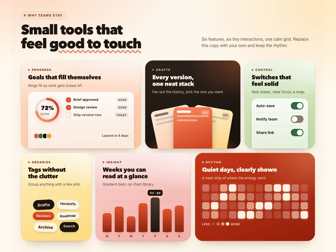
A bento grid breaks the habit of three identical feature cards in a row. This section lays six dimensional tiles on a twelve-column grid in two staggered rows, so the eye has a place to start and somewhere to go, and the whole thing fits a single desktop screen. Each tile has soft light, a white sheen, a hairline edge and an illustrated mini interface that bleeds off the bottom, the way real product screenshots do: a progress card with a gradient ring and task list, a fan of version cards over a glowing ink tile, a panel of real switches, a cloud of tags, a gradient bar chart with a tooltip and a glowing heat strip on a tomato tile. Grain and a warm page glow add depth in both themes. Nothing needs a library, only plain CSS and a little inline SVG, and almost nothing loops: the ink tile glow breathes and the eyebrow dot pings, while everything else waits for hover or focus. It suits product tours, app landing pages, studios and any site that wants to show several strengths at once. On phones the tiles stack in one column, on tablets they pair up, and reduced-motion visitors see the finished state.