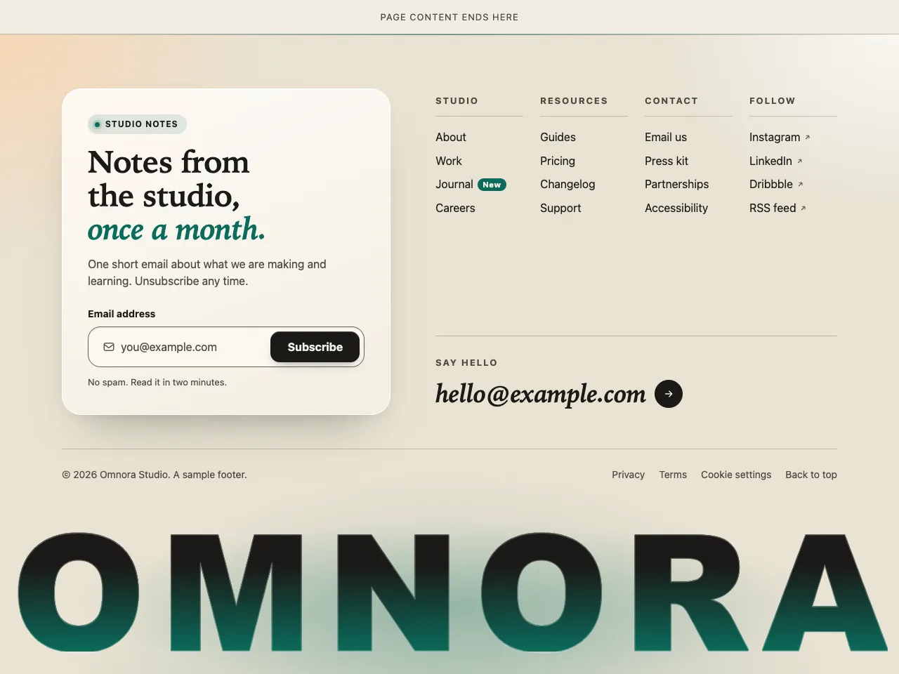
Mainmast is a site footer that ends the page with a statement. The brand name is set in a heavy grotesk, scaled with container query units so it runs from one edge of the screen to the other at every width from a phone to a wide desktop. Every letter is fully visible and filled with a luminous gradient, cream into mint in the dark theme and ink into verdigris in the light one, with a soft glow rising behind it and a fine film grain over the whole scene. Above it, a frosted glass card holds a serif headline that invites people to join a monthly newsletter; the form is labelled, validated by the browser and works as a plain mail or post form when JavaScript is off, with an inline thank-you message when it is on. Four short link columns, a large italic email link and a quiet legal row keep the practical parts tidy. A single verdigris and mint accent family carries the glow, hover, focus and the italic words. Hovering a letter lifts it and lights it up, and that effect is switched off for visitors who ask for reduced motion. It suits studios, agencies, publications and any brand with a short, strong name.
Pairs well with the Atelier, Canvas and Ledger Looks in the Dapols website studio. See website examples.